The Dow Jones Industrial Average suffered its worst one-day point loss today. The market was down all day, but fluctuated dramatically with the headlines. Today’s widespread selling pushed the market into official correction territory with the Dow down 12.8% from its February 12 all-time high. S&P 500 and NASDAQ are down 12.0% and 12.7% from their respective February 19 all-time highs.
At 8 calendars days long (6 trading days), this is the fastest 10% correction for the S&P 500 on record. Of the 36 previous corrections since 1950, 11 have turned into bears of -20% or more with an average loss of 34.4%. The 25 other corrections averaged a loss of 14.3% and lasted 133 calendar days on average. It was 422 calendar days from the end of the last correction on December 24, 2018 to the recent S&P high on February 19. We covered the
history of corrections on the blog back on January 6.
Fears of coronavirus spreading rapidly and causing some sort of lasting global supply chain disruption and economic downturn have come at a time of elevated market valuations, seasonal February weakness and the heating up of a contentious presidential election battle.
No matter how you slice it this is disconcerting for the market. But let’s look at the facts we have. This decline has brought elevated valuations and euphoric sentiment down from the recent lofty levels and election cycle patterns remain encouraging. Heightened fear of the virus spreading rapidly here in the U.S. and elsewhere has folks reacting to the headlines without reading further.
For example in this story from the Bay Area CBS affiliate “
California Monitoring 8,400 For Coronavirus; Shortage Of Testing Kits Addressed,” if you scroll down a bit and read the details of the story it says, “
The California Department of Public Health maintains the risk to the general population in California is low for the coronavirus, and that more than 80% of people infected with the virus have mild or no symptoms.”
Fear is clearly spreading faster than the virus. Official coronavirus numbers from best sources we can find show a situation that continues to improve on a global level. Using the data from the excellent interactive web-based dashboard that tracks the Global Cases of Coronavirus COVID-19 created by the
Center for Systems Science and Engineering (CSSE) at Johns Hopkins University we have created the table and graphs below.
The rate of new cases per day has decreased from the mid-February spike to 1.5% and the death rate has stabilized over the past few days with the vast majority on Mainland China. Optimistically, the recovery rate continues to rise and is now at 40.3%. Of the 82,594 global cases at this writing, 2,810 have died, 33,253 have recovered and 46,531 remain infected.
So, while there is still plenty to be concern about for all of us individually and for health and government officials the numbers we have are improving. On January 29 we detailed the
history of how contagions and outbreaks have impacted the market on the blog. Since the coronavirus was confirmed and made public on January 10, 2020 the S&P 500 is down 8.8% at today’s close.
Down January & December Closing Low
Coronavirus has also impacted a couple of our key indicators: the January Barometer (page 22 Stock Trader’s Almanac 2020) and the December Closing Low Indicator (page 34 Stock Trader’s Almanac 2020). January 31’s market decline turned the January Barometer negative as the S&P 500 finished January down 0.2%. This diminished our near-term outlook for the market as every down January since 1950 was followed by a new or continuing bear market, a 10% correction or a flat year.
Heightened coronavirus uncertainties this week knocked the Dow below its December closing low. Years the Dow has closed below its previous December closing low in Q1 the Dow has fallen 10.5% further on average. But in the last 22 occurrences since 1980, 15 of those years have seen gains for the rest of the year averaging 9.7%. Only two years had big hits 2002 (-14.1, Iraq War) and 2008 (-32.7, Financial Crisis).
The table below show the years when both the January Barometer as measured by the S&P 500 were down and the Dow closed below its previous December closing low in the first quarter. We have also created a composite seasonal pattern chart of these 22 years showing how the Dow, S&P 500 and NASDAQ Composite behaved on average in such years.
As you can see from this table and graph most of the negatives of a Down January and a Dow December closing low breach appear to have been satisfied. No one knows what will happen with this virus, but history and the data suggest we have seen the bulk of the worst of the virus and the market decline.
The “Best Six Months” have a 70-year track record and have worked over many timeframes and through crises, exogenous events and all types of markets. Our other seasonal and cyclical trading and investing strategies have also stood the test of time. So stick to the system, heed stop losses and remain rational.
Pulse of the Market
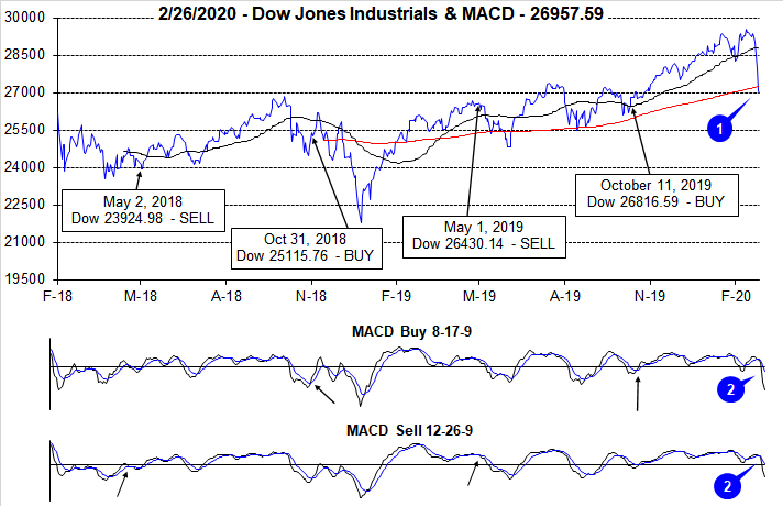
Rebounding from the first down January since 2016, DJIA got off to a strong start early in February before succumbing to rapidly spreading fears and worries over the coronavirus and its impact. The rate of the market’s decline appears to have outpaced the spread of the virus with DJIA diving below its 50- and 200-day moving averages (1) in just two trading sessions. This complete reversal of momentum has been confirmed by both the faster and slower moving MACD indicators (2). Both MACD indicators are currently negative and trending lower.
Earlier this week DJIA recorded its third Down Friday/Down Monday (DF/DM) of the year (3) after logging its second in the previous week. Back-to-back DF/DM occurrences have often been significant inflection points for the market, but with a post-occurrence track record that is similar to a single DF/DM. If a quick recovery from the DF/DM transpires, then the tendency is for the market not to suffer a prolonged, damaging retreat. Thus far, there has not even been an attempt at a bounce and/or recovery. Based upon Friday’s track record so far this year (down 7 of the last 8), it may be March before an up day materializes.
This week’s data does not appear in the table but there is little doubt it will look quite bad. Prior to this week’s market rout, NASDAQ had enjoyed sixteen weekly gains in 21 weeks (5). S&P 500 had fifteen advances in 20 weeks (4). DJIA was not as successful, up thirteen of 20 weeks. The relative tranquility the market had enjoyed since last August has come to an end. Volatility is likely to remain elevated as long as the coronavirus continues to spread, and governments continue to appear to struggle with its spread.
Market breadth measured by NYSE Weekly Advancers and NYSE Weekly Decliners (6) provided no indication that the market was on the verge of sinking into a correction right up until last week as readings remained consistent with the trend at that time. Positive weeks had NYSE Weekly Advancers exceeding Weekly Decliners while negative weeks had Weekly Decliners taking the majority.
Weekly New Highs did rebound with the market in the first half of February (7) and reached a peak of 669 two weeks ago when major indexes were trading at or near all-time highs. This was the largest number of New Highs since December 9, 2016. There likely won’t be many New Highs this week while New Lows are likely to swell.
The 30-year Treasury bond yield fell below 2% for the first time since the end of August 2019 last week (8). Safe haven demand, of which the 30-year Treasury is, has continued to rally this week. When the rush to safe haven assets slows, it could be an early indication that the selloff may be nearing its end.