It’s nice to know so many folks are reading their trusty Stock Trader’s Almanac. The past two days our friends on financial news television have been championing the historical outperformance of the stock market in April and Q2, especially in the pre-election year, giving credence to our long-held belief and demonstration of the validity and value of historical seasonal and cyclical market patterns and trends.
But perhaps now that everyone is talking about these patterns on TV we should be more cautious. As the market rallied to new highs this month (except for NASDAQ – and
not on an inflation adjusted basis by a long shot) under increased volatility we have already begun to trim positions, tighten stops and take a more defensive posture.
And remember, that while April has been a banner month historically for the stock market and is likely to be solid in 2015 as well, it is the last month of the best six months. In fact, these past best six months have not been so stellar. DJIA and S&P are up less than 3% since October 31, though NASDAQ and Russell 2000 have done better, up 6.2% and 6.8% respectively at this writing. Not for nothing, but that’s rather weak for the 4-year cycle sweet spot and Best Six Months. This seasonal and cyclical underperformance is somewhat disconcerting. To wit:
“If the market does not rally, as it should during bullish seasonal periods, it is a sign that other forces are stronger and that when the seasonal period ends those forces will really have their say.” — Edson Gould (Stock market analyst, Findings & Forecasts, 1902-1987)
From our
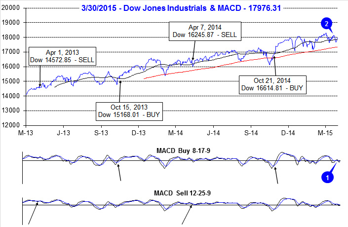
October 21 Best Six Months Seasonal MACD Buy Signal the market is up more than double the gains from 10 days later. Now here we are on the eve of the last month of the Best Six Months with our reliable MACD indicators negative and falling as the market sells off into the close. On April 1 we begin to track MACD for our Best Six Months Seasonal Sell Signal. These days we look for MACD confirmation across the major indices as well as both the fast and slow MACD indicators. Currently it will take a gain of about 20 S&P points and 170 DJIA points for a Sell Signal NOT to trigger tomorrow.
However there is hope. The first two trading days of April are two of the more bullish days of the year, and they have been more bullish in recent years. As noted in the Stock Trader’s Almanac, in a multitude of places, first trading days and beginnings of months have a distinct bullish bias, but as the whole month is one of the best months of the year, its first two days are in the upper echelon as well.
As we track the end of the Best Six Months and our MACD Sell Signal and the market traces out the end of the 4-Year Cycle Sweet Spot in Pre-Election Q2, you may wish to consider logging some profits, trimming underperformers and getting positioned for a potentially volatile period during the Worst Six Months May-October. The Mideast is hot again and the mudslinging is about to begin in the 2016 Presidential race, which are bound to create nagging uncertainty for the stock market.
Pulse of the Market
As of yesterday’s close, both the faster and slower moving MACD indicators applied to DJIA (1) and S&P 500 were negative, but trending toward a new buy signal. Any modest gain today would turn the faster moving MACD Buy indicator positive for DJIA and S&P 500. The shift in momentum came after DJIA slipped below its 50-day moving average (2) for the second time in March. Perhaps anticipation of Q1 earnings season, beginning in April, can provide the catalyst for DJIA to break out of the trading range it appears to be stuck in since last November.
The first quarter of 2015 has turned out to be one filled with positive and negative weekly streaks. DJIA started off the year with four losing weeks out of five, followed by three straight weeks of gains and then it was down in four of the last five weeks (3). Even though losing weeks have outnumbered winning weeks, DJIA has managed to climb a modest 0.9% higher year-to-date at yesterday’s close. Over the past five weeks, buying the close on Friday and holding over the weekend as been a profitable trade four times (4). Traders and investors are clearly headline conscious however; most of the weekend news has turned out to be positive thus far.
S&P 500 (5) and NASDAQ (6) are also in the midst of comparable weekly losing streaks. Although NASDAQ has fared slightly better when it eked out a modest 0.2% advance during the week ending February 27 while DJIA and S&P 500 modestly declined. NASDAQ’s weekly close above 5000 (6) is the first time in the history of the Pulse (back to May 2001) and the first time since March 10, 2000. It only took 15 years, but technology’s growth has finally lived up to all the hype from then as earnings and thus valuations are at far more reasonable levels today than then.
The ratio of Weekly NYSE Advancers to Decliners (7) continues to show signs of troubled commodity sectors. Energy and precious metal related companies are a drag more often than not. As a result the NYSE Advance-Decline line has rolled over since February’s advance. This is a sign of a market that is likely range bound.
Two weeks ago the weekly CBOE Put/Call ratio at 0.48 sank to its lowest level since June 2014 (8) when it reached 0.47. Back then the market did top out and move sideways through July before pulling back in early August. Low readings like this are indicative of excessive bullishness which suggests traders and investors are either fully invested or awfully close.
Click for larger graphic…
|
April Almanac, Vital Stats & Strategy Calendar: Up Nine Years in a Row
|
|
By:
Jeffrey A. Hirsch & Christopher Mistal
|
March 26, 2015
|
|
|
|
The first trading day of April and the second quarter, has enjoyed exceptional strength over the past 20 years, advancing 16 times with an average gain of 0.56% in all 20 years for S&P 500. Declines occurred in 2001, 2002, 2005 and 2013. In 2013, April 1 was also the day after Easter which has been the S&P 500’s worst post-holiday trading session. From 1984 to 2003, S&P 500 declined 16 times. In the ten years since, S&P has been up seven times, but down three of the last four years.
April marks the end of our “Best Six Months” for DJIA and the S&P 500. On April 1st, we will begin looking for our seasonal MACD sell signal and corresponding early signs of seasonal weakness. Our recent Official Seasonal MACD Sell Signal Alerts on April 9, 2010, April 13, 2011, April 3, 2012, April 1, 2013 and April 7, 2014 proved rather timely as the market ran into trouble shortly thereafter in 2010, 2011 and 2012. In 2013 and 2014, the market did log modest gains during the “Worst Six Months”, but increasing volatility made it a tense ride.
April 1999 was the first month to gain 1000 DJIA points. However, from 2000 to 2005, “Tax” month was hit, declining in four of six years. Since 2006, April has been up nine years in a row with an average gain of 3.1% to reclaim its position as the best DJIA month since 1950. April is third best for S&P and fourth best for NASDAQ (since 1971).
The first half of April used to outperform the second half, but since 1994 that has no longer been the case. The effect of April 15 Tax Deadline appears to be diminished. Traders and investors are clearly focused on first quarter earnings during April. Exceptional Q1 earnings and positive surprises tend to be anticipated with stocks and the market moving up in advance of the announcements and consolidating or correcting afterwards.
Typical pre-election year strength does bolster April’s performance since 1950. April is DJIA’s best month in pre-election years (+4.2%), second best for S&P 500 (+3.6%) and third best for NASDAQ (+3.7%). Small caps, measured by the Russell 2000 also perform well with gains (+3.4%) in seven of nine pre-election year April’s since 1979.
Options expiration week frequently impacts the market positively in April and DJIA has the best track record since 1990, with an average gain of 1.4% for the week with just five declines in 25 years. The first trading day of expiration week has a slightly better record than expiration day and the week as a whole is generally marked by respectable gains across the board. The week after has a softer long term-record; however since 1994 gains have become the norm. Over the past 21 years, NASDAQ and Russell 2000 have finished April better than DJIA and S&P 500. See Bullish and Bearish days in Vital Statistics table below.
| April (1950-2014) |
| |
DJI |
SP500 |
NASDAQ |
Russell
1K |
Russell 2K |
| Rank |
|
1 |
|
3 |
|
4 |
|
3 |
|
4 |
| #
Up |
|
43 |
|
45 |
|
28 |
|
24 |
|
22 |
| #
Down |
|
22 |
|
20 |
|
16 |
|
12 |
|
14 |
| Average
% |
|
1.9 |
|
1.5 |
|
1.4 |
|
1.6 |
|
1.6 |
| 4-Year Presidential Election Cycle Performance
by % |
| Post-Election |
|
1.9 |
|
1.6 |
|
2.4 |
|
2.5 |
|
2.2 |
| Mid-Term |
|
0.8 |
|
0.2 |
|
-0.1 |
|
-0.1 |
|
0.7 |
| Pre-Election |
|
4.2 |
|
3.6 |
|
3.7 |
|
3.0 |
|
3.4 |
| Election |
|
0.9 |
|
0.7 |
|
-0.2 |
|
0.9 |
|
0.01 |
| Best & Worst April by % |
| Best |
1978 |
10.6 |
2009 |
9.4 |
2001 |
15.0 |
2009 |
10.0 |
2009 |
15.3 |
| Worst |
1970 |
-6.3 |
1970 |
-9.0 |
2000 |
-15.6 |
2002 |
-5.8 |
2000 |
-6.1 |
| April Weeks by % |
| Best |
4/11/75 |
5.7 |
4/20/00 |
5.8 |
4/12/01 |
14.0 |
4/20/00 |
5.9 |
4/3/09 |
6.3 |
| Worst |
4/14/00 |
-7.3 |
4/14/00 |
-10.5 |
4/14/00 |
-25.3 |
4/14/00 |
-11.2 |
4/14/00 |
-16.4 |
| April Days by % |
| Best |
4/5/01 |
4.2 |
4/5/01 |
4.4 |
4/5/01 |
8.9 |
4/5/01 |
4.6 |
4/9/09 |
5.9 |
| Worst |
4/14/00 |
-5.7 |
4/14/00 |
-5.8 |
4/14/00 |
-9.7 |
4/14/00 |
-6.0 |
4/14/00 |
-7.3 |
| First Trading Day of Expiration Week: 1990-2014 |
| #Up-#Down |
|
17-8 |
|
15-10 |
|
14-11 |
|
14-11 |
|
10-15 |
| Streak |
|
U1 |
|
U1 |
|
U1 |
|
U1 |
|
U1 |
| Avg
% |
|
0.3 |
|
0.3 |
|
0.2 |
|
0.3 |
|
0.001 |
| Options Expiration Day: 1990-2014 |
| #Up-#Down |
|
17-8 |
|
16-9 |
|
12-13 |
|
16-9 |
|
15-10 |
| Streak |
|
D1 |
|
U4 |
|
U2 |
|
U4 |
|
U4 |
| Avg
% |
|
0.2 |
|
0.1 |
|
-0.1 |
|
0.1 |
|
0.2 |
| Options Expiration Week: 1990-2014 |
| #Up-#Down |
|
20-5 |
|
17-8 |
|
15-10 |
|
17-8 |
|
18-7 |
| Streak |
|
U1 |
|
U1 |
|
U1 |
|
U1 |
|
U1 |
| Avg
% |
|
1.4 |
|
1.1 |
|
1.1 |
|
1.1 |
|
1.0 |
| Week After Options Expiration: 1990-2014 |
| #Up-#Down |
|
15-10 |
|
15-10 |
|
16-9 |
|
15-10 |
|
15-10 |
| Streak |
|
D1 |
|
D1 |
|
D1 |
|
D1 |
|
D1 |
| Avg
% |
|
0.1 |
|
0.2 |
|
0.5 |
|
0.2 |
|
0.7 |
| April 2015 Bullish Days: Data 1994-2014 |
| |
1,
2, 7, 13, 15-17 |
1,
2, 7, 16, 17 |
1,
2, 6, 9, 13 |
1,
2, 6, 7, 16 |
1, 2, 9, 16, 21, 22 |
| |
21,
22, 28, 29 |
21,
22, 29 |
21,
22, 28-30 |
17,
21, 22, 29 |
27-30 |
| April 2015 Bearish Days: Data 1994-2014 |
| |
8 |
24 |
8 |
24 |
8 |
| |
|
|
|
|
|
|
April 2015 Strategy Calendar
|
|
By:
Christopher Mistal
|
March 26, 2015
|
|
|
|
|
What Sectors to Own & What to Avoid During Worst Six Months
|
|
By:
Christopher Mistal
|
March 24, 2015
|
|
|
|
Each and every year, as the “Worst Six Months” May through October for DJIA and S&P 500 near, the “Sell in May” debate begins. Since we already know that the market tends to post the majority of its gains from November through April and does very little from May to October, we are not going to bother debating whether one should actually sell in May or not. Instead, let’s focus on what tactical changes can be made in portfolios to take advantage of what actually does work during the “Worst Six Months” while either shorting or outright avoiding the worst of the worst.
In the following table, the performance of the S&P 500 during the “Worst Six Months” May to October is compared to fourteen select sector indices, gold and the 30-year Treasury bond. Nine of the fourteen indices chosen were S&P Sector indices. Gold and 30-year bond are continuously-linked, non-adjusted front-month futures contracts. With the exception of two indices, 1990-2014, a full 25 years of data was selected. This selection represents a reasonably balanced number of bull and bear years for each and a long enough timeframe to be statistically significant while representing current trends. In an effort to make an apple-to-apple comparison, dividends are not included in this study.
![[Various Sector Indices & 30-Year Treasury Bond versus S&P 500 during Worst Six Months May-October Since 1990 table]](/UploadedImage/AIN_0415_20150324_Worst6_Sectors_Master_Table.jpg)
Using the S&P 500 as the baseline by which all others were compared, seven indices outperformed during the “Worst Six Months” while nine underperformed based upon “AVG %” returned. At the top of the list are Biotech and Healthcare with average gains of 10.27% and 5.17% during the “Worst Months.” But, before jumping into Biotech positions, only 20 years of data was available and in those years Biotech was up just 55% of the time from May through October. Some years, like 2014, gains were massive while in down years losses were frequently nearly as large.
Runner-up, Healthcare with 25 years of data and a 68% success rate is probably a safer choice than Biotech. Its 5.17% AVG % performance comes by way of one less loss in five additional years of data and just two double-digit losses, both in bear markets during 2002 and 2008.
Other “Worst Six” top performers consisted mostly of the usual suspects when considering defensive sectors. Consumer Staples, 30-year Treasury bonds, gold and Utilities all bested the S&P 500. Information Technology also performed surprisingly well, but appears to be highly correlated with S&P 500 (losing years in bear markets and similar monthly performance figures). Although not the best sector by AVG %, Consumer Staples advancing 80% of the time is the closed thing to a sure bet for gains during the “Worst Months.”
At the other end of the performance spectrum we have the sectors to short or avoid altogether. The Materials sector was the worst over the past 25 years, shedding an average 2.07% during the “Worst Six.” Industrials, Transportation and Consumer Discretionary also recorded average losses. However, based solely upon the percentage of time up, the stocks only, PHLX Gold/Silver index is the most consistent loser of the “Worst Six” advancing just 44% of the time.
Also interesting to note is the fact that every sector, gold and 30-year bonds are all positive in May, on average. It’s not until June do things begin to fall apart for many sectors of the market and the market as a whole. July tends to see a broad bounce, but it tends to be short-lived as August and September tend to be downright ugly on average. It is this window of poor performance that has given October a lift in the past 25 years. Only Biotech, 30-year bonds, gold and natural gas manage to post gains in August and September.
During the “Worst Six Months,” Biotech, Health care and Consumer Staples looks like the best place to be while Materials, Industrials and Gold/Silver mining stocks could be shorted or avoided. May looks like a great time to rebalance a portfolio as you will likely be closing out long positions into strength and short trade ideas are worth considering given June’s nearly across-the-board poor performance.
|
Seasonal Switching Strategy Update: Worst Six Months Preparation
|
|
By:
Christopher Mistal
|
March 19, 2015
|
|
|
|
In eight trading days, the first quarter of 2015 will come to a close. After a respectable fourth quarter rally last year, the market has struggled over the past three months. At yesterday’s close DJIA was up 1.4% year-to-date, S&P 500 was up a modest 2.0% and NASDAQ had a 5.2% gain. Whether or not the current 6-year old bull market is forming a top is still open for debate. However, what is not open for discussion is the fact that the “Best Six Months” of the year could come to an end as early as April 1.
The long-term track record of our Seasonal Switching Strategy, which is based upon the “Best Six Months”, has a solid track record of outperformance with potentially less risk compared to a buy and hold approach. Since 1950, DJIA’s average annual gain has been 8.4%. Over the same time period, DJIA has lost an average 1.1% during the “Worst Six Months,” May through October, and gained an average 9.3% during the “Best Six Months,” November through April.
Detractors are quick to point out that there have been positive “bad” months and negative “good” months. This is absolutely true as there is no trading or investment strategy that works 100% of the time (even the best will report a trading loss every once and a while). Even in pre-election years, the best performing year of the four-year cycle, there have been some rather nasty selloffs. Most recently in 2011 when DJIA fell 9.4%, S&P 500 dropped 11.4% and NASDAQ declined 10.4% during the worst months.
Our Seasonal Switching Strategy may not suit every investor or trader, but before dismissing it consider this. Would you book a Gulf Coast or Caribbean vacation during hurricane season? Sure, you might find a great bargain and have a great trip, but it could just as easily turn out to be a real disaster.
Applying Our Seasonal Switching Strategy
Use of the words buy and sell has created some confusion when used in conjunction with our Seasonal Switching Strategy. They are often interpreted literally, but this is not necessarily the situation. Exactly what action an individual investor or trader takes when we issue our official fall buy or spring sell signal depends upon that individual’s goals and, most importantly, risk tolerance.
A conservative way to execute our switching strategy, the in-or-out approach as we like to refer to it entails simply switching capital between stocks and cash or bonds. During the “Best Months” an investor or trader is fully invested in stocks. Index tracking ETFs and mutual funds are an easy and inexpensive way to gain stock exposure. During the “Worst Months” capital would be taken out of stocks and could be left in cash or used to purchase a bond ETF or bond mutual fund.
This approach works very well for retirement accounts where the goal is to build wealth over time. It comes with the added advantage of potentially less risk of a “buy and hold”. Of further benefit, you may find summertime vacations and activities more enjoyable because you will not be concerned with stock market gyrations while your nest egg is parked in the relative safety of cash or bonds.
The approach that we use in the Almanac Investor Stock and ETF Portfolios involves making adjustments to your portfolio in a more calculated manner. During the “Best Months” additional risk can be taken as solid market gains are most likely, but during the “Worst Months” risk needs to be reduced, but not necessarily entirely eliminated. There have been several strong “Worst Months” periods such as 2003 and 2009. Taking this approach is similar to the in-or-out approach however; instead of exiting all long stock positions a defensive posture is taken.
Weak or under-performing positions can be closed out, stop losses can be tightened, new buying can be limited, and a hedging plan can be implemented. Purchasing out-of-the-money index puts, adding bond market exposure, and/or taking a position in a bear market fund would mitigate portfolio losses in the event a summer pullback manifests into something more severe such as a full blown bear market.
Worst Months Defense
We are not issuing the signal, we are only prepping for when it arrives.
Currently, the Almanac Investor Stock Portfolio and ETF Portfolio are positioned for the “Best Months” with no exposure to bonds, distant or nonexistent stop losses and a long-only bias. But, beginning April 1, 2015 we will begin looking for our seasonal MACD sell signal accompanied by signs of seasonal weakness. Our recent Official Seasonal MACD Sell Signal Alerts proved rather timely as the market topped shortly thereafter. Even last year, DJIA gained just 2.3% between our April Seasonal Sell and our October Seasonal Buy.
When both the DJIA and S&P 500 MACD Sell indicators trigger a sell signal, we will issue an Almanac Investor Alert. We will either outright sell specific positions or implement tight trailing stop losses. Bearish/defensive positions in: iShares Barclays 7-10 Year Treasury (IEF), iShares Barclays 20+ Year Treasury (TLT), Ranger Equity Bear (HDGE) and other protective strategies will also be considered. All stock and ETF holdings will be evaluated at that time. ETFs providing exposure to sector seasonalities ending in April and May along with under-performing stocks in the Almanac Investor Stock Portfolio may be sold at that time as well.
For traders and investors employing the “Best 6 + 4-Year Cycle” as detailed on page 62 of the Stock Trader’s Almanac 2015, this year’s upcoming Seasonal MACD Sell signal could be overlooked. Again, individual risk appetite will determine which of the above paths are preferred.
|
Stock Updates: Small-Caps Silently Outperform
|
|
By:
Christopher Mistal
|
March 17, 2015
|
|
|
|
Tomorrow we may know a little more about the future course of interest rates when the Fed concludes its two-day meeting. They may choose to remain “patient” for additional data or they may be comfortable with what they already have and choose that nearly seven years of zero was enough and the time has come. Ultimately, for the stock market there are just three possible outcomes at the end of trading tomorrow. The market can be higher, lower or unchanged. Since the S&P 500 has only closed unchanged 367 times in the 22,399 trading days in our database going back to 1930 this scenario is rather unlikely.
![[S&P 500 Performance Before & After FOMC Meeting Statement since 2008]](/UploadedImage/AIN_0415_20150317_B4-After_Fed.jpg)
In the above chart, the 30 trading days before and the 60 trading days following the release of a scheduled FOMC statement have been plotted. All told there have been 57 such meetings since January 1, 2008. Of these 57, the S&P 500 responded with a gain on the day 34 times and declined 23 times. The three lines plotted represent the average percent change of the S&P 500 following all 57 meetings, all positive S&P 500 responses and all negative S&P 500 responses. Note that after 60 trading days (approximately 3 months), that three lines converge right around 3.0% which suggests that the market, on average, has enjoyed the largest gains following a “disappointing” Fed day.
Stock Portfolio Updates
Over the past four weeks since last update, through the market’s close on March 16, S&P 500 slipped 0.8%. However, Russell 2000 climbed 1.4% over the same time period while collectively the three Almanac Investor Stock Portfolios climbed 0.8%. Our portfolio’s gain was held in check by a still substantial cash position. Unlike last month, the Small-and Mid-cap portfolios performed best, each advancing 1.1%. The Large-cap portfolio declined 1.2%. Only United Continental Holdings (UAL) and UnitedHealth Group (UNH) gained ground in the Large-cap portfolio over the past four weeks.
Compared to recent portfolio updates, the past four weeks were rather quiet. No positions were stopped out, sold or doubled. There were several positions that did make solid moves higher though. Newtek Bus Services (NEWT), one of the three oldest holdings, jumped from $15.13 to $18.53 (+22.5%). NEWT did gain some additional exposure when a new analyst initiated coverage in the second half of February. Frankly, it was long overdue after all the company has a 64% EPS growth rate, has announced that it will likely pay dividends valued at $1.80 in 2015 and even after its latest move, still trades with a P/E of 16.
Repligen (RGEN) also had a sizable move, from $24.77 last month to $30.81 (+24.3%) yesterday. Most of this move occurred last Friday when RGEN reported earnings and issued guidance. Actual earnings were lacking, but 2014 revenue growth and guided 2015 numbers were more than enough to inspire traders and investors. In 2014 sales increased 27% while management sees 19-24% growth in 2015 even after accounting for negative currency impacts. Present day valuations are stretched, but their sales growth suggests they could easily outgrow it.
Excluding Group 1 Automotive (GPI), down 5.4% since last update, all other Mid-cap portfolio positions had a respectable month. Falling oil prices boosted Jetblue Airways (JBLU) 11.1%, Lithia Motors (LAD) added 5.5% on an earnings beat and Amerco Inc (UHAL) quietly crept 1.5% higher.
With major indices struggling during the usually bullish first half of March and the often treacherous end-of-March rapidly approaching, all positions in the Stock Portfolio are on Hold.
See table below for updated Stop Losses.
Disclosure Note: At press time, officers of the Hirsch Organization, or the accounts they control, held a position in UNH.
|
Mid-Month Update: End-of-Q1 Often Treacherous
|
|
By:
Christopher Mistal
|
March 12, 2015
|
|
|
|
Late last month, we noted March’s historical tendency towards increased volatility. On its historically bullish first trading day, March did deliver as the DJIA and S&P 500 soared to fresh all-time highs and NASDAQ closed over 5000 for the first time in nearly 15 years. Since then, the market has struggled as incoming economic data has been firm enough to fan the fears of interest rate hikes sooner, rather than later. The prospect of higher interest rates here in the U.S. and the ECB commencing QE have caused the U.S. dollar to soar to its highest level in over a decade. The surging U.S. dollar is in turn pressuring commodity prices and earnings estimates for large multi-national corporations. The net effect has driven DJIA and S&P 500 below December’s highs and their respective 50-day moving averages. NASDAQ has fared better, but still has given back roughly half of its gains since breaking out in mid-February.
![[DJIA Daily Bar Chart]](/UploadedImage/AIN_0415_20150312_DJIA.jpg)
![[S&P 500 Daily Bar Chart]](/UploadedImage/AIN_0415_20150312_SPX.jpg)
![[NASDAQ Daily Bar Chart]](/UploadedImage/AIN_0415_20150312_NASDAQ.jpg)
The market’s recent weakness has done some technical damage. Stochastic, relative strength and MACD indicators are all negative. DJIA and S&P 500 are once again negative (or near) year-to-date. Their breakouts have failed. NASDAQ is a bright spot though. It has held its 50-day moving average and the breakout thus far. The next key level of support for DJIA and S&P 500 is their 200-day moving averages. For DJIA this is just slightly more than 17,250 and S&P 500 is 2002 as of today.
Bullish Cluster & Triple Witching Option Expiration Week
Next week is options expiration week. March is the first time of the year when stock options, index options, index futures, and single-stock/ETF futures all expire at the same time. This event is often referred to as Quadruple Witching or as we prefer to call it in the Stock Trader’s Almanac (page 78), Triple Witching. Other Triple Witching months include June, September and December. Besides being the first Triple Witching event of 2015, next week is also unique as it hosts a three-consecutive-day bullish cluster on March 16 through the 18. This cluster is frequently responsible for respectable gains during options expiration week.
![[March’s Bullish Cluster]](/UploadedImage/AIN_0415_20150312_March_SP_Prob_Chart.jpg)
March’s option expiration week performance is second only to December’s and has a clearly bullish bias. DJIA and S&P 500 have recorded weekly gains in nearly twice the number of weeks as there have been declines. NASDAQ’s track record since 1983 is slightly softer with 19 advances and 13 declines. However, the week after tends to be bearish for DJIA and S&P 500 with declines easily outnumbering advances. NASDAQ is mixed.
Last Three or Four Trading Days
Further compounding the pain during the week after March options expiration is end-of-quarter weakness. Over the past 25 years the DJIA and S&P 500 have declined 17 times and advanced 8 with an average loss approaching 1.0% near the end of March. Excluding advancing years, the average decline is right around 1.6% for DJIA and S&P 500. End-of-quarter portfolio restructuring likely plays a role as managers lock in any gains and establish positions for the next quarter. These declines can begin on either the fourth-to-last trading day or the third.
![[Last Three or Four DJIA Trading Days in March]](/UploadedImage/AIN_0415_20150312_DJIA-EndOfMarch.jpg)
![[Last Three or Four S&P 500 Trading Days in March]](/UploadedImage/AIN_0415_20150312_SP500-EndOfMarch.jpg)
As you can see, the second half of March has the potential to cause pain. However, the market has proven especially resilient in recent months. Plunging crude oil and a surging dollar have not ended the fourth longest bull market in history. The U.S. is still one of the healthiest developed markets out there. Any second-half March weakness would likely reset previously stretched sentiment and technical indicators, paving the path to additional new all-time highs in April, the top-performing DJIA month since 1950 and the last month of the “Best Six Months,” as the market makes its way toward our projected first-half highs around DJIA 19000, S&P 500 2250 and NASDAQ 5000 (either side of its previous all-time high).
|
Seasonal Sector Trades: Not So Sweet Cocoa
|
|
By:
By Christopher Mistal & Jeffrey A. Hirsch
|
March 10, 2015
|
|
|
|
Cocoa tends to begin a seasonal decline in early to mid-March through the end of May (shaded in yellow below), instituting a short position in our seasonal best-trade category. Selling on or about March 13, right before St. Patrick’s Day and holding until on or about April 16, for an average holding period of 23 trading days, has been a winner in 32 of the past 42 years. Even in the face of the 2008 great commodity bull-run, this seasonal trade worked with a potential profit of $1,730 per contract. Since 1997, this trade has only posted two losses.
![[March Short Cocoa (July) Trade History]](/UploadedImage/AIN_0415_20150310_CC_History.jpg)
![[Cocoa (CC) Weekly Bars (Pit Plus Electronic) and 1-Yr Seasonal Pattern]](/UploadedImage/AIN_0415_20150310_CC_Seasonal.jpg)
Cocoa has two main crop seasons. The main crop from the Ivory Coast and Ghana in Africa accounts for approximately 70% of the world production and runs from January through March. As inventories are placed on the market, this has a tendency to depress prices, especially when demand starts to fall for hot chocolate drinks and chocolate candy in the spring and summer time. After briskly rebounding from its late-January/early-February low, cocoa’s momentum has stalled with technical indicators signaling overbought conditions just ahead of typical seasonal weakness.
Futures traders could consider an outright short position or bearish option strategy using the July contract to take advantage of this setup. Stock and ETF traders could try to short iPath Pure Beta Cocoa ETN (CHOC) however; it is not that liquid with barely two thousand shares, on average, trading hands over the past three months.
Another possibility, with plenty of liquidity and possibly less risk is Hershey Foods (HSY). When cocoa prices rise, Hershey’s price tends to decline and the opposite often holds true as well. However, HSY is also subject to currency exchange rates as a global company. A surging U.S. dollar will inevitably impact earnings and share price even when HSY’s input costs decline with falling cocoa.
However, even more interesting is Rocky Mountain Chocolate Factory (RMCF). With a market cap around $85 million, this is definitely a small-cap company. They are headquartered in Durango, Colorado and operates as a confectionery franchisor, manufacturer and retail operator. RMCF’s valuation is reasonable with a P/E of 17 and a price to sales ratio right around 2. Cash on hand and debt are also reasonable. They also pay a respectable dividend (3.4% yield) and have a share buyback program. RMCF does have some foreign operations, but the majority of their operations are in the U.S. which mitigates much of the potential damage a stronger dollar could cause.
![[Rocky Mountain Chocolate Factory (RMCF) Daily Bar Chart]](/UploadedImage/AIN_0415_20150310_RMCF.jpg)
Up until the past few trading sessions, 2015 had been good to RMCF. Shares had rallied from $13.12 on December 31 to a high of $15.60 on February 26. Shares have since pulled back to trade just under $14.00. The move lower has turned stochastic, relative strength and MACD indicators all negative, but the 50- and 200-day moving averages have not been violated on a closing basis, yet. RMCF could be considered on dips below $13.62. If purchased, a stop loss of $12.60 is suggested. This trade will be tracked in the Almanac Investor Small-Cap Portfolio. Falling input costs, reasonable valuation, solid growth prospects and reduced concerns about the stronger dollar make RMCF attractive.
|
Super Boom Update: Enjoy This Bull Market While It Lasts
|
|
By:
By Jeffrey A, Hirsch & Christopher Mistal
|
March 05, 2015
|
|
|
|
Happy Birthday Bull Market! By the 20% bear market rule this bull market turns 6-years old next week. Using the widely accepted Ned Davis Research criteria for a bear market of a 13% DJIA decline after 145 calendar days, we count the 16.8% DJIA decline from April 29, 2011 to October 3, 2011 as an official bear market. S&P lost 19.4% and NASDAQ was down 18.7% over that time span.
We still expect the market to leak higher through the spring of 2015 toward our forecasted first half high of about DJIA 19000. Then after some choppy sideways summer trading, the market should rally into yearend perhaps making a slightly higher high. But after that we are concerned that the final cyclical bear market of this secular bear market that began in 1998-2000 will begin to manifest itself.
That’s right; we are one of the few who believe that we are still in a secular bear market. Except for a few apocalyptic forecasters and permabears, who will remain nameless and who have been rather off in their projections, most of us agree that March 2009 was the low point of this secular bear market. But people seem to forget that secular bull and bear markets do not necessarily begin and end at their highest and lowest points.
As we illustrated on February 12 in “
What’s Next for the Stock Market?”, the last two secular bears had a 3-stage decline with the middle one being the greatest, but the end point being the 3rd and most shallow cyclical bear with the low in 1982 and 1949 being in the vicinity of the previous two highs. The last decline of the previous secular bear after WWI bottomed in 1921 at the end of the secular bear when the US-German Peace Treaty was signed in Berlin on August 25. 1921. The bear market low was August 24, 1921.
So, we felt this was a perfect time to update what my friend Josh Brown,
The Reformed Broker and CEO of
Ritholtz Wealth Management, calls his “Favorite Chart on Earth.” As a likely contentious election year gets underway in 2016 and the effects of the end of US quantitative easing and likely rate hikes begin to be felt, the next 2-3 years are likely to be more difficult for the global economy and the market than the last 6 have. So enjoy it while you can. A major pause or two over the next few years is quite likely from an historical perspective.
Back in 2011 when my book
Super Boom: Why the Dow Jones Will Hit 38,820 and How You Can Profit From It (Wiley) hit the stores I drafted a bold 15-year DJIA projection chart. This forecast does not anticipate DJIA reaching 38,820 until around the year 2025 – and for the current secular bear market that began in 2000 to drag on until 2017 or 2018 before the next boom and secular bull commences.
As DJIA has pushed substantially above the high range of that chart (not because of a massive global economic boom or peace, but because of unprecedented easy monetary policy), I have again raised the floor on my initial forecast. The end game still is in play and the means to the end has only been elevated to account for this new easy money world. We still expect some tough sledding over the next few years in the market.
When I first made my super boom forecast in May 2010 in this space DJIA was around 10,000, unemployment was quite high, the great recession was barely in the rearview, and global debt was a new and growing concern. So my prediction that the Dow would reach 38820 by 2025 seemed absurd to many when we announced it. That came as no surprise—all bold predictions are first lambasted before proven true. This super boom is not only plausible, but mathematically and historically within reason. Now that DJIA is above 18,000 it looks even more credulous.
As for the next Super Boom already being underway, we are not convinced just yet. The low point of the economy and the bottom of the stock market now clearly appear to be behind us. But other factors have yet to align. The war on terror is still raging, a paradigm shifting technology has yet to emerge and inflation is subdued. Sorry, but 3D Printing and Fracking are not likely to change the world for the individual consumer like the car or the PC did. CPI has risen just 34% since 2001. We are still plagued by political dysfunction and the next administration is likely to have a rather tough go of it before we can get back to some real bipartisan leadership and policy initiatives.
This projection was based upon nearly 50 years of research and analysis into stock market cycles, patterns and seasonality. When I drew it in March 2011, I anticipated that the market would at least challenge its previous all-time highs before failing and falling to a low in midterm election year 2014 and another low in 2017-2018 before the next super boom truly began. That was based upon a projected high of 14,000 and an above-average bear market loss approaching -40%.
I used the final cyclical bear markets of the last secular bears ending in 1921, 1949, and 1982 along with the long-term support level around 8,000 from the post-9/11 lows, through the 2002 and 2008-2009 bear markets as the basis for the potential magnitude of this decline. Now that DJIA has exceeded the high end of my range, the 2018 midterm low is likely to be higher, likely in the DJIA 14,000-15,000 range or a 20-30% decline from expected high point levels. The purple line in the chart below illustrates the updated forecast.
Now for the good news. While we are projecting a garden variety bear market of -20-30% to bottom sometime in the 2016-2018 timeframe, early signs of the end of the secular bear and coming Super Boom have begun to materialize presently. The commodity secular bull market since 2000 is beginning to wane and even the 30-year bull market in bonds that began near the end of the last secular bear for stocks in 1980-82 looks to be finally fading.
In addition, new market leaders are rising to the top and we may get our next paradigm shifting culturally enabling technology from Biotech, Healthcare or perhaps robotics or alternative energy. But that remains to be seen. Either way, continue to let your winners ride and enjoy this bull while it lasts, Just be prepared for gains to be less easy to come by over the next few years while the stage is set for the Next Super Boom and secular bull market.
|
ETF Trades: Ratchet Up Stops & Take Some Profits
|
|
By:
Christopher Mistal
|
March 03, 2015
|
|
|
|
Next week, on March 10, this bull market will be starting its seventh year. It arrives at this milestone by avoiding a 20% (widely accepted threshold for a decline to be called a bear market) or greater decline which was narrowly avoided in 2011 when S&P 500 dropped 19.4% from its April closing high to its October closing low. So far DJIA has gained 179.3%, S&P 500 213.0% and NASDAQ a whopping 294.8% at their closing highs yesterday. In the tables below, you can see the current bull market has lasted longer and returned more than the historical averages across all three indices. However, there have been bull markets of longer duration and magnitude than now, just not that many.
April Sector Seasonality
Normally at this time we would be considering new long ideas from the Computer Technology sector as seasonal strength in begins in April and runs until July. Historically, the Computer Technology has averaged 8.4%, 5.4%, and 5.9% over the last 15-, 10- and 5-year time periods respectively. However, this year the corresponding position in SPDR Technology (XLK) was not closed out in January. XLK could be considered on dips below $42.50 accompanied by improving Stochastic, relative strength and MACD indicators.
ETF Portfolio Updates
Since
last update less than two weeks ago, the
Almanac Investor ETF Portfolio is unchanged overall. Major indices have broken out to new all-time highs and the NASDAQ closed above 5000 for the first time since 2000. This strength has translated into additional gains for the “core four” ETFs,
SPDR DJIA (DIA),
iShares Russell 2000 (IWM),
PowerShares QQQ (QQQ) and
SPDR S&P 500 (SPY) and other positions, but the energy sector softened over the same time period eroding the performance of
SPDR Energy (XLE),
First Trust ISE-Revere Natural Gas (FCG),
United States Natural Gas (UNG) and
United States Oil (USO). The net result is the average open position return remains the same 9.0%.
With ample time remaining within their respective seasonally favorable periods, XLE, FCG, UNG and USO can still be considered on dips below their buy limits. Inventory data has been the biggest drag on energy following its overdone price collapse last year into early this year. Both oil and natural gas inventories are more than ample here in the U.S. while demand has remained somewhat tepid. But, as we have all bore witness recently, retail gasoline price is on the move higher again in anticipation of the summer driving season, refinery maintenance and shutdowns. Higher prices for gasoline will likely also lead to higher prices for crude oil.
Natural gas inventories are healthy now, but it seems like winter just does not want to let up. Here in the Northeast we will be facing two more storms and sub-freezing temperatures over the course of the 10-day forecast. The longer winter drags on, the less time there will be for suppliers to build inventory ahead of the inevitable summer cooling season. Much of our electricity is produced from natural gas and when temperatures soar, electric demand soars as well.
Biotechnology seasonal strength ends in early March. Sell iShares NASDAQ Biotech (IBB). For tracking purposes, IBB will be closed out of the ETF Portfolio using today’s closing price. As an alternative to outright selling, an even tighter stop loss than 5% could also be implemented. An outright sale seems like the best idea as IBB has lost momentum and many of its individual holdings are also beginning to show signs of weakness.
Also sell Vanguard REIT (VNQ). After enjoying a brisk January rally with bonds, VNQ faltered in February and broke down through its 50-day moving average. Even though the Real Estate sector normally remains strong through the beginning of May, we will take VNQ’s nearly 10% gain (at yesterday’s close) now. For tracking purposes, VNQ will be closed out using today’s closing price. Here again, a tight 1-2% trailing stop is an alternative.
With the end of the “Best Six Months” quickly approaching all positions, except XLK, XLE, FCG, UNG and USO, are on hold. See table below for updated suggested stop losses. Most have been raised.
Disclosure Note: At press time, officers of the Hirsch Organization, or accounts they control held positions in IWM, IYT, QQQ, SPY, UNG, USO, XLF, XLI and XLV.