The pesky, eclectic
Three Peaks and a Domed House Top Pattern (3PDH), we updated you on last month at this time persists and is getting closer to rolling over as we enter the teeth of the Worst 4 Months summer doldrums.
The updated 3PDH chart below continues to align with seasonal trouble and waning market readings. We have removed the question mark on point 15 and added points 16-19 and 22 for color and moved 23 to the June 19 high. The pattern is always evolving. If this 3PDH pattern does continue to develop and complete, points 1 through 20 look rather set.
The beginning of the current 3PDH pattern at point 1 (not labeled) corresponds to the points 10-14 of the previous 3PDH’s separating decline. The May 21, 2015 S&P 500 top is point 23 of the last one and point 5 (the middle peak) of the current pattern. And the ultimate bear market low in February 2016 is both point 28 of the last pattern and point 14 of the current 3PDH.
We have also drawn horizontal black lines at 5 big round levels that correspond with various technical support levels with the resultant percentages of what the decline to those levels would be from the recent June 19 high.
The market may hold out through the typical
NASDAQ Midyear Rally through mid-July or even until later this summer, but all of our 5 Market Disciplines in the
Market at a Glance are tuckered out and signaling a market retreat in the near term.
Market psychology is fading and reminds us of the summer of 2015. In the accompanying chart courtesy of our friends at
Investors Intelligence, back in 2015 the difference between bullish advisors and bearish had been in a downtrend as the market moved virtually sideways in a topping process from March to July.
Then the bottom fell out in late-August and stayed down through September until blowing through that low in February 2016 creating a Ned Davis Research defined bear market bottom (DJIA 13% decline after 145 calendar days, peak to trough) with DJIA and S&P 500 down over 14% and NASDAQ down over 18% at the time.
While it’s not precisely the same conditions this time around – seldom is – it is reminiscent, especially considering the seasonally weak time of year is upon us again. We are not expecting Ursa Major, but a decline of 10% or more is quite probable.
Pulse of the Market
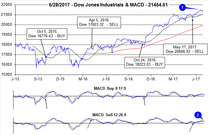
After the close on June 9, we issued our
Seasonal MACD Sell signal for NASDAQ. That Alert marked the beginning of the “Worst Four Months,” July through October. And even though DJIA has climbed to new all-time highs this month (1), it has essentially done very little since March 1 when it closed at 21115.55. Nearly four months later, DJIA is barely over 1% higher. In the four months leading up to March 1, DJIA gained better than 17% (Nov 1 through March 1). DJIA appears to be stalling and both the faster and slower moving MACD indicators (2) have issued recent sell signals in confirmation.
Further evidence of a waning rally can be seen in DJIA’s recent weekly performance. DJIA’s best weekly advance was the last full week in May. Weekly gains have been tapering off since then (3). The Down Friday/Down Monday (4) that occurred at the end of May has been completely ignored by the market, thus far. Historically, sometime during the 90 calendar days after a Down Friday/Down Monday occurrence, DJIA has registered a meaningful decline.
S&P 500 (5) and NASDAQ (6) are also showing signs of fatigue. S&P 500 has been up in four of the last five weeks, but the last two weekly gains have been marginal. NASDAQ appears to have switched from leading the market higher to now leading it lower. If it can find and hold support, NASDAQ’s Midyear Rally could still materialize.
NYSE Weekly Advancers and Decliners (7) are also painting an uncertain overall picture. Weekly Advancers have been outnumbered by Weekly Decliners for three straight weeks. If the majority of an index’s components are declining then there is an increasing probability that the index will soon begin to decline.
NYSE Weekly New Highs (8) have also been choppy, peaking at the end of April at 544 while NYSE Weekly New Lows were at their highest level last week since the week ending November 18, 2016. Crude oil’s decline likely contributed to broader energy sector weakness, but for the rally to continue, new lows need to stop climbing and new highs need to begin to expand again.
The spread between the 90-day Treasury Rate and the 30-Year Treasury Rate (9) has declined to its lowest level since early 2008. This flattening of the yield curve is not going to help the major banks and the celebration today about future dividend increases and share buybacks could be short-lived.